This Sunday, i had the Idea of designing a new logo for my Photo-Art-Jonny project. At the moment, i have several design-projects, like logos, Web and product labels design.
Therefore I wanted a more graphical logo, but still artistic. Something that fits my identity and my personality.
The new logo is basically a penrose triangle, without the outer lines, and without hilight and shaddow.
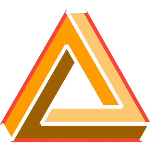
But with the Triangle facing upwards, it didn’t work for me. There was something missing. By turning it, things start to change.
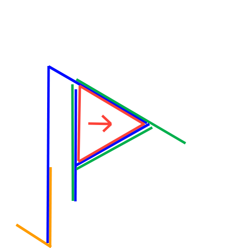
Blue we have a P shape, for Photography, wich is still my main passion.
Orange we’ve got a Shape that kind of looks like a J for my name Jonathan.
There is an A shape (green), or something that comes close to an A.
And finaly, the Red Triangle is facing forwards, meaning the progress I made in the past and that I will make in the Future.
Peace and joy to anyone!
